Sam and I had discussed our film schedule as our previous dates were cancelled due to the weather. We both found that by having actors, it was difficult to reorganise other actors as we both Sam and I were working against the deadline.
By filming in four different locations, this meant that we had to organise cameras and tripods including actors to use at the same time. However, we were still dependent on the weather.
Due to this error, we later decided that we will only film Sam (the lead singer) on his own in the car, as we would be able to use more effective camera angles.
Written by Hollie and Sam
Friday 9 October 2009
Wednesday 7 October 2009
Analysis of existing CD cover
 This was the first page of the Black eyed peas CD Digipack, Sam and I like how this layout had an attractive background. We want to include this information in our own CD pack. The song title above each paragraph of information is in bold white writing. This makes it easier for the audience to scan the booklet through, to find specific songs. The white writing stands out from the dark grey background. However, the red pattern along the bottom of the pages gives the page an interesting look. Sam and I would like to include this convention in our own CD cover as the mixture between the 3 colours. The small print along each song includes producers, copywriting issues and directors.
This was the center double page of the Black eyed Peas Digipack. This image is very striking image as the band members look as if they are coming out of the page. Sam and I would like to use this idea and create a booklet of our own which only shows images of the band. This image clearly shows each band member and connotes that the album is firey.

Within the Digipack, each band member is thanking their own family, friends and producers for creating the album. The double page spread is taken up 60% of images of the cartoonised band member. This look visually appealing, as a golden statue of 'Will.I.Am' connotes that the album is high quality. Again, the use of only 3 colours looks professional and not too crowded. The block of white writing is relatively small, therefore, the audience would not read it, however, they would look through the page and be interesting by the image of the left hand side. This page is repeated but by using a different colour for the statue of each band member, this looks effective because the image is so large.

The back cover of the Black Eyed Peas is very simplistic. The black and white colour scheme maintains throughout the entire booklet. However, by having an attractive font of the album name catches the audience's eye. The song names are in the center of the back. This looks professional. The back also has a barcode, this is a legal requirement which Sam and I will have to include.
Written by Hollie
Tuesday 6 October 2009
Problem shooting
During filming the band performing on stage, it was very difficult to film all of the band with a steady camera.
Each band member was moving in and out of shot, which looked unprofessional
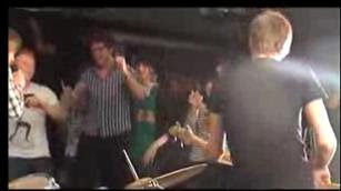
Due to the time schedule we had to stick to, Sam and I were unable to refilm the same scene before the deadline but plan to change this scene for the final draft edit.
Written by Sam
Each band member was moving in and out of shot, which looked unprofessional

Due to the time schedule we had to stick to, Sam and I were unable to refilm the same scene before the deadline but plan to change this scene for the final draft edit.
Written by Sam
Sunday 4 October 2009
Change in actors
After a meeting on our actors, Sam and I decided that we were going to concentrate on just the band members. This saves time and organising filming dates. By having a smaller number of actors, this also conforms to the typical convention of minimal characters.
Written by Sam
Saturday 3 October 2009
Location permission
Sam and I have researched our locations and we have permission to film on Stapleford Highstreet. locations we have used such as the Drama room for our live performance, both drama teachers were happy to lend the room out to us during lunch hour.
Written by Hollie
Written by Hollie
Subscribe to:
Posts (Atom)