In what ways does your media product use, develop or challenge forms and conventions of real media texts?
The main convention of a typical music video is that there are many close ups of the band and the main singer. Sam and I have used this convention throughout our music video, particularly during the scene in the car, Sam is singing, looking away from the camera, this captures the stars emotion. This is used to conform to the theory of Roy Shuker, for the music video to create a connection with the audience. The lead singer will also sing directly to the camera, this then portrays the singer’s facial expression and looks effective on camera and the audience can capture a sense intimacy .
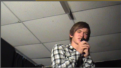
We have used this convention during the concert shot. Another convention typical of a music video is the use of fast cutting. This editing technique creates a sense of pace for the audience, generally for a quick genre of music such as Indie, rock or pop; numerous short, shots will be used.

Sam and I used this throughout, particularly when Sam climbs into the car and slams the door on the beat of when the vocals begin. However, if the music video is slow paced such as R & B; long, prolonged shots will be used and cutting in between scenes is a slower pace. This can create a sense of romance or sadness – depending on the song.
Another convention typical of a music video is to use a well lit location. We have used Stapleford high street during one particular shot, this was filmed in the middle of the day,
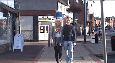
Therefore, there is plenty of light on set. This then conforms to the theory of Richard Dyer – giving the impression to the audience that the singer is seen as an idol on screen. The singer’s face is continually well lit, and therefore the audience can see clearly their idol. During the shot of Sam singing directly into the camera, we used two large lights to highlight his face from the rest of his body, therefore, the audience can clearly see that it is the star that is singing.
Conventionally, music videos usually film one or two scenes outside in the summer, this is because the lighting is brighter and portrays positive connotations. On the other hand, if the song is depressing, the video will be shot in a dull light or in the rain – such as the ‘Plain White Tees – Hate’ – which we analysed.
By music videos having the conventional ‘repeatability factor’ conforming to Archer’s theory, the audience can watch the music video over and over again. By doing this, the audience can analyse and notice different techniques about the existing video. Sam and I have conformed to this theory as we have included a narrative, therefore the audience can follow and continue to watch the video over again as they would notice different conventions about it. This is evident in nearly all music videos as by creating an interesting video which contains a narrative, the audience will follow and understand the story that is being told through the lyrics of the song.
The main conventions of our genre we have chosen – Indie/ Rock – are that the bands are usually filmed on stage, performing a live set.
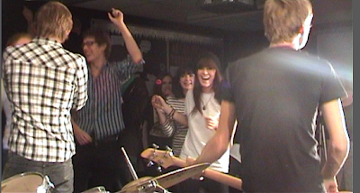
Sam and I have filmed a performance scene with a live audience; we used lighting and the necessary instruments, but looked realistic. This is evident in bands such as The Arctic Monkeys, The Subways and Death Cab for Cutie. By conforming to this convention, the camera can then film close ups of the instruments and give the audience a sense of attending a concert, as if they were going to see them perform.
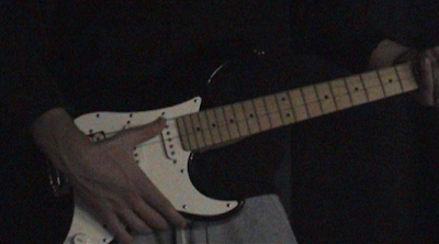
Another popular convention is to again use a series of quick cuts which match the beat of the music – following Goodwin’s theory. This sets the pace and gives the video more continuity as the edits will flow together. We used this theory as we used a series of photographs of the characters, cutting from each photo to the beat of the music. Singing directly to the camera is a convention generally used in all music videos; however, Indie Rock is well known to use this convention regularly.
A limited amount of characters are also to be used within a typical indie rock music video as it makes it easier for the audience to understand the narrative. During our music video we only used a main protagonist, the antagonist girlfriend and the boyfriend; this made the narrative easy to understand. This convention excludes the crowd during the performance. Usually, only the band members (generally 2 -4 members) plus another unknown character would be used within the video.
How effective is the combination of your main product and ancillary texts?
Our music video has conformed to typical forms and conventions of our music video. For example, on our website, we used influences such as the Arctic Monkeys website and The Killers – other bands of the same genre. We included tour dates down the left hand side using a clear, serif font
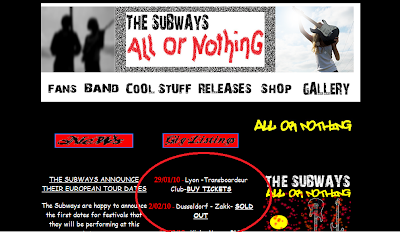
This makes it easier for the audience to read and understand. We also included news about the band and inserted hyperlinks to direct to another page. We researched the type of information we wanted to include by looking at other website’s news pages such as personal information about band members.

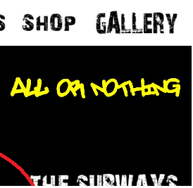
By using many hyperlinks, this is a simple way of adding extra information to the main home page. We decided to use a contrast of bright colours such as Red, Yellow, White and Blue on a black background. We chose these colours because they are vibrant and will stand out as it continues the colour scheme from the CD cover. The images we used on the Website were original which we edited on Paint shop pro.

The use of black and white images in contrast with the bright text and black background looked very effective as the colour stands out and catches the audience’s attention.
The codes and conventions we used on our CD cover was that we continued to carry the colour scheme of bright colours onto the front cover. We used a paint splattered effect which added to the detail. The main heading of ‘The Subways’ continually uses the ’28 days later’ font we uploaded from a website – dafont.com.

We chose this font because it looked similar to the original ‘Subways’ text. The font was serif and was a bold design which stood out on a black background. By using this in both ancillary texts, it looked more professional as an advertising campaign for the band.
Our ancillary texts and our media production, we used original images from the band members and characters. This booklet contained 5 images of each band member and we edited the images, cutting out the background. Each image is well lit with the equipment we were provided with, this gave a higher quality of image and was easier to edit with the green screen in the background. We took the images from several angles such as low angle, high angle and close up.
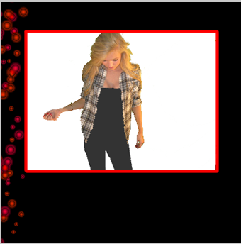
This gave us a wider range of shots to chose from for our texts. We found this looks professional as all the audience’s focus would be on the band members.
Another combination between our texts and the music video is that the CD cover also uses a black background, similar to the website, we have tried to include a black background during the scenes with Sam singing. Both the exterior CD cover and the interior, including the booklet inside all contain a large amount of block, black colour. This adds to the effect of the indie rock genre and conforms to the audience’s needs as block colour is frequently used in ancillary texts such as ‘Chase and Status’ and ‘Death Cab for Cutie’ as it looks more attractive.
What have you learnt from your audience feedback?
The audience feedback Sam and I received was both critical and positive. We each watched the rest of the class’s music videos and all wrote positive and negative feedback to share at the end. I thought that this was the most effective way of collating all comments. Our audience mentioned that the storyline we presented was ‘clear and concise’, this feedback is very encouraging as we wanted the audience to understand the narrative, in addition to this, this is proof that we fulfilled the typical conventions of having a storyline.
Other feedback was the popularity of the shot through the steering wheel of Sam whilst singing,
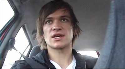
the effect of this is that the audience would not usually expect a low angle shot within a car. The camera angle is placed in an unusual position, giving the impression that the star does not notice he is being filmed. This gives the audience an insight into the private life of the star – Dyer’s theory suggests that this creates a sense of intimacy between the audience and the star. Other feedback we received was helpful as the slow motion shot of Sam passing the couple on the street was also very constructive.
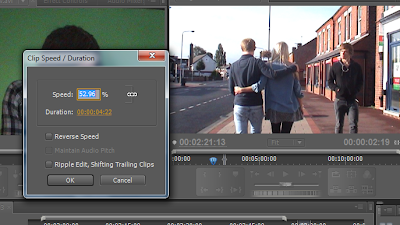
Sam and I were unsure about creating this effect of tension but took a risk which evidently paid off. We contrasted this by using fast cuts between Jack and I which looked effective against the music as this conforms to Archers theory and helps to create a sense of rhythm.
We also received constructive criticism for our music video; our audience thought that the shot of Sam singing over the scene of the concert looked too ghostly.
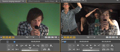
Their advice was to create the background of this shot more transparent, so Sam would stand out more in front of the crowd. We took this advice on board and looked at how we could change this. Lip syncing was also part of the criticism we obtained, this was evident during the long shot of me singing in a close up shot to the camera, which we changed slightly before our final edit was completed. I also feel that a particular shot of Sam driving is too low and we should have re-filmed this, unfortunately, we did not have time to do this and only used a short few seconds of the clip, but does not hinder the overall quality of the video.
The website audience feedback I received was also relatively positive. My audience liked the use of images used on the homepage, particularly the top left and right original images we previously edited. I agree with this comment as this draws the audience’s eye immediately to the centre of the page; where the main heading of ‘The Subways’ is positioned. Other feedback consisted of the appropriate use of hyperlinks, by using hyperlinks; it was easy to navigate to and from the homepage. In addition to this, the feedback also expanded on this point and mentioned they were partial to the colour of the text of the hyperlink as they are usually blue and stick to the colour scheme. Another point my audience gave was they were fond of the subheadings within the main banner at the top of the homepage, this is conventional for Indie/ Rock bands- we also added a blur image when the text was clicked – which looked effective as it is an additional feature to the homepage.
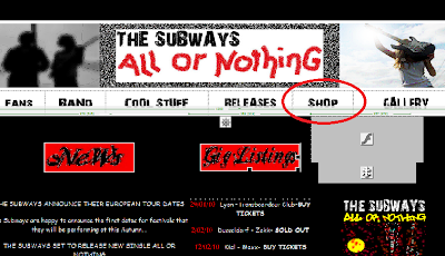
A criticism we received for our website was for the News block of information and the gig listings to be more spaced out. I agree with this comment, by using a grid type layout, the text does look very close together. If we were to re-do the homepage, we would look into using a different grid layout as it was very difficult to move text and images around. Another criticism I would make on our website is that we could have used more images and flashing fonts. This would be difficult to achieve as we had very little time to create our homepage. However, by overly using flashing texts and images, the website may look too busy and may hinder the overall quality.
Our Digipack also received very encouraging feedback. Comments such as ‘professional looking’ and ‘the balance between images and text is effective and works well’. We researched other CD covers such as the ‘Black eyed peas’ and found our idea of a booklet inside. This contributed to the positive feedback of ‘well researched and thought out’. Also, other feedback was that the different front covers of both the CD cover and the booklet cover inside were different, but still continued the theme of guitars and the same ‘The Subways’ font at the top.
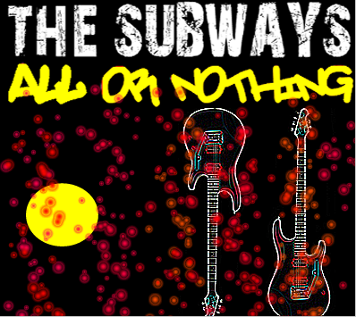
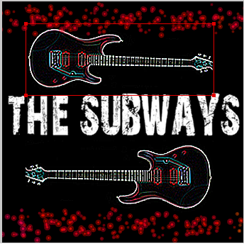
Criticisms we received were that we could have added an image onto the back of the sleeve for the booklet as without the booklet being inside, it looked plain. I disagree with this statement because the overall appearance of our Digipack is relatively busy with a paint splattered pattern and images, by leaving a panel blank, it breaks up the ‘busyness’. Also we could have made the inner panel more appealing as the design is quite simplistic and doesn’t match the genre of Indie Rock. However, I am very pleased with the result of our Digipack.
How did you use new media technologies in the construction and research, planning and evaluation stages?
During our research stage of the coursework, Sam and I first started to look at the types of music genre that were available via the unsigned.com website. This new media technology allowed us to research any unsigned artists. This saved a lot of time. Without this form of technology, we would have to look up a range of unsigned artists from books in a library, which would take a long time to find a suitable band. We chose a genre and the website allowed us to look at all bands that fall into the same category.

Other forms of new media were websites such as Youtube, Facebook and Myspace. Youtube allowed Sam and I to have millions of music videos on one site. This allowed us to view any genre of music and watch the video to gather some ideas for our own project, we watched evidence of theorists such as Dyer’s theory of stardom, and Hebdige’s subcultures. Myspace was also used in our search to find our own signed band. We emailed the band personally asking for their permission, which they replied back. Without this form of new media, Sam and I would have had to write a formal letter to the bands address and wait for a reply. This process would have been very time consuming and is not guaranteed to have a reply within a few days.
Facebook, was another form of new media that Sam and I used to gather information about our chosen artist. Sam and I researched our band’s information and news on how they formed; this information was useful as we transferred this onto our news pages of our website.

Without this new form of technology, Sam and I would have to look up information about the band in a library, which again would have been time consuming.
During our planning of our music video, we created an anamatic for our storyboard. This new media technology allowed Sam and I to cut from each shot to the pace of the music. Without this form of media, the audience would not be able to see the overall effect of our video as our coursework was uploaded onto our blogs.
During the creation of our video, Sam and I used a green screen during the shots of the star singing. Dyers theory suggests that Sam plays the role of both the protagonist and the main singer. The audience then consumes the star, which is a strong selling point for our band. By using the green screen, Adobe Premier Pro allowed us to easily edit out the green colour. Without this technology, the editing process would have been prolonged as editing in a black background would hinder the quality of the shot.
During the construction our website, the new media technology programme ‘Dreamweaver’ allowed Sam and I to add a table structure to our home page. This created a block structure which was a good basic layout to work from. This technology also allowed us to manipulate our own images by changing both the contrast and colour scheme. Our two main images used at the header of the webpage were both manipulated using this programme. We also included flash images; this was a good convention to have included in our webpage as by using flashing images and text, the audience were instantly drawn to click on the link.
Dreamweaver allowed us to change the pace of the flashing and the colour scheme. We could adapt this to match the ongoing colour scheme of Digipack.
The new media technology allowed me to change the colour scheme of my Digipack easily. The programme ‘Fireworks’ was relatively fast, which allowed importing original and edited images fast and efficient. The programme allowed me to experiment with different fonts and sizes. I found that the visual technology was easy to adapt and therefore save time on creating our Digipack.
During my evaluation, I used blogger.com to blog my progress on all three ancillary texts. This was a simple way to show my ideas and allowed me to upload and show photos and screen shots of my editing process. By uploading photos directly to the blog, the reader can then easily visualise the content I am analysing. Screen shots were also uploaded onto my blog, which is an easy way to present my work through this form of technology. I could embed existing videos from sites such as Youtube, which take the reader directly to the video from my blog. This was useful when analysing popular videos such as Beyonce and the Plain White Tees. Uploading our signed band’s song onto our blog was also useful as the reader could then listen to the genre of music we had chosen. In addition to this, this form of new media technology is an organised way of presenting our work, as using a paper folder may lead to lost pages and untidiness.
No comments:
Post a Comment